Colours are an integral part of part of our everyday life. They are also great way to add value to an application. There is a wealth of knowledge and resource available for picking colours and combinations between them, and there are also a few resources available around colour gradients, but only static ones. Often, once you’ve picked a theme of a few colours, you’ll want to generate gradients for areas where the colours intersect. For colours that are close together this is easy. Going from a light green to a dark green has a pretty straight-forward series of intermediary colours. But for colours that are far apart, this can prove tricky.
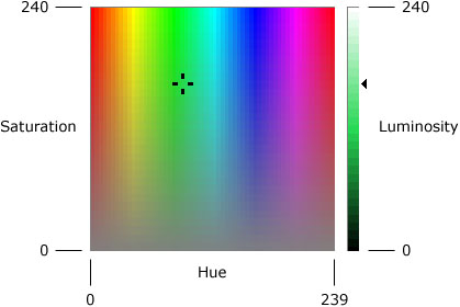
Lets start by briefly going over the idea of ‘colour space’. Digital colours are defined using a series of values in a colour space, 2 of the most common being Red-Green-Blue(RGB) and Hue-Saturation-Luminosity(HSL). For design, people often choose HSL due to the fact that it’s uniformly easy to configure colours. In RGB, to define a yellow you must know to mix green and blue together in a value such as rgb(0,255,255), which is often unintuitive. There are of course advantages to RGB over HSL, which we will come to later.
Resources online deal almost exclusively with static colours. This is great, but there are other subtleties when you animate colours, as our brain deals with changing values of colour very differently to static images. As an example, let’s look at one of the worst examples, animating from bright pink to lime green:
[image of the animation]
You can see there’s a strange strobe effect as you pass through the colours. You can spot various intermediaries, which gives a sort of disco effect as you pass through it. Even for colours that aren’t that far apart, the pulsing disco effect is still there. The image below still looks like it pulses orange, even though we know that orange is on the path between yellow and red
[image of transitioning yellow to red]
So how do we solve this?
It’s very tricky to put down any rules for how these transitions should look. For large transitions we are effectively forced to show some sort of intermediary state, so there are a few strategies we can approach this from. 1) Desaturate the colour and then desaturate out the other side. This in effect sends the transition through grey 2) Deluminate the colour and reluminate. This is basically fading to black and back again. 3) Ease through an alpha value. This is the same as transitioning through transparent / invisible.
First-off, we really need to discount Alpha. A lot of applications rely on certain items being completely opaque, and alpha values can add another level of complexity that we just don’t need. The second option of delumination is promising, but it’s hard to tell when we should fade to black and when to white, and we still need to move away from the target colour in certain circumstances
So we’re left with the first option of desaturation. Here’s where RGB comes in nicely, because it’s really easy to calculate how to linearly transition to grey using RGB. Let’s have a look at our original disco transition:
[image of Rgb transition through grey]
There’s still a clear intermediary grey there, but it’s not too intrusive and because grey has no colour itself, your brain translates this more to removing the old colour and then adding the new one. This is how css handles transitions, so we're certainly getting there.
The grey itself looks like it’s a bit darker than the colours though. Most colours are read by the eye as being lighter, the exceptions being blue and red. We can try to compensate for this by adding a bit of lightness to the intermediary grey.
[image of transition through lighter]
There are also a few other cases for consideration. For darker colours, we no longer transition through black, as we’ve added some lightness for the lightness colours. This leaves us with the case where we transition from black to just-off-black by going through dark grey (a much lighter colour). To fix this, let’s stretch the scale of the darker half of the lightness and compress the lighter half (as off-whites now also have the same issue in reverse).
[image of transition through lighter]
So if you ever want to have colours transition from one to another, check out the finished product by installing the npm package, and enjoy the smoothest colour transitions available.